BoBoBREWSKI
BURP!
- Joined
- Sep 17, 2008
- Messages
- 15,448
- Likes
- 7,607
- Points
- 113
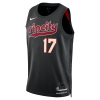
https://news.sportslogos.net/2024/0...city-classic-edition-jersey-leaks/basketball/
I like ours! Rip City!
I like ours! Rip City!
Follow along with the video below to see how to install our site as a web app on your home screen.
Note: This feature may not be available in some browsers.
Muy Sueno FAMS!
Muy Sueno FAMS!
Time to mix it up. Isn’t this basically what we’ve had for the past 5 seasons?

btw, check out the bad ass gold that Bucky is wearing?
You know that guy was laying pipe.

I like 'em, but I'm not so sure of the explanation.
"Portland continues to use the City Edition uniforms to honor legendary coach Jack Ramsay, with a sublimated plaid pattern to match the jackets he wore while leading the franchise to the 1976-77 title. Their 2017-18, 2021-22 and 2023-24 City sets also had plaid accents."
That doesn't strike me as very plaid, being a single color and no intersecting bands. Sublimated polka dot sounds more accurate.


100% accurate.I don't love ours, but man some of those are terrible!
There's looks like the image just stopped rendering, and the font size was too smallTwolves are the worst IMO
Twolves are the worst IMO
Yeah the ones at that link may have been from last year. Maybe? Not sure.Hmm, I didn't look at the embeded link. The main article its from shows different jerseys without the actual plaid, although looking back at it, there's a slight hint of plaid within Rip City itself:
https://news.sportslogos.net/2024/0...city-classic-edition-jersey-leaks/basketball/
Yeah the ones at that link may have been from last year. Maybe? Not sure.
How about they honor the lower case letters, the diagonal stripes or the vertical lettering? The hints of plaid has been done to death.
How about they honor the lower case letters, the diagonal stripes or the vertical lettering? The hints of plaid has been done to death.
Where’s the picture?Twolves are the worst IMO
Jersey alterations are like weddings. Someone is always unhappy. Nothing ever goes completely right for everyone.
Hell, I still want Benny Beaver back.
No you ass…..its….#BAMAnd their uniforms are pretty bad too!
Boom! (that's how you do it @THE HCP )

