- Joined
- Oct 5, 2008
- Messages
- 130,289
- Likes
- 150,968
- Points
- 115
In case you haven't heard, the Portland Trail Blazers are working on a uniform redesign, which will probably be ready by 2015. We didn't want to wait that long, so we recently put out the call for Uni Watch readers to submit their own Blazers-redesign concepts.
Dozens of readers accepted this challenge. Here are the most successful and interesting ones, broken down by category:
1. Best Pinwheel-Based Designs: Dan Hallber and Tyson Staab. The Blazers' pinwheel logo, which is supposed to represent the five-on-five dynamics of a basketball game, is one of the most unique marks in the league, and many readers found ways to give it a prominent role in their jersey designs. The most interesting approaches were taken by Dan Hallberg and Tyson Staab, both of whom chose to make the pinwheel big -- like, really big. The first three designs shown below are Hallberg's, and the fourth image is Staab's (for all of the images in this column, you can click to see larger versions):


These designs are flawed but intriguing. Hallberg's concepts would be better if his oversized pinwheel graphics wrapped around to the back and/or onto the shorts, and Staab's uni set would benefit from better typography and a crisper presentation style. But both of them make good use of scale by blowing up the pinwheel to the point where it's almost an abstraction but still recognizable. These could definitely be revised into something very workable.
Pinwheel Honorable Mentions: In a clever move, Dennis Kuzman used the pinwheel design as the basis for a set of knee braces. ... Cole Hammers designed his own pinwheel-based type font. ... Kyle Emry made the pinwheel design look a little more modern by extending the lines and making them pointier. ... Tyler Smith suggests that the pinwheel be screened onto the back of the jersey, like Nike does with many of its college basketball designs. ... Bryan Spencer has changed the pinwheel from five-on-five to five-on-five-on-five. Maybe he knows something about upcoming NBA rule changes that the rest of us don't?
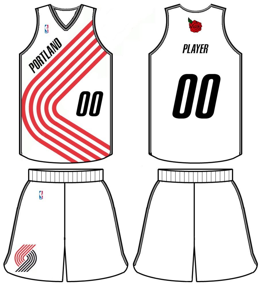
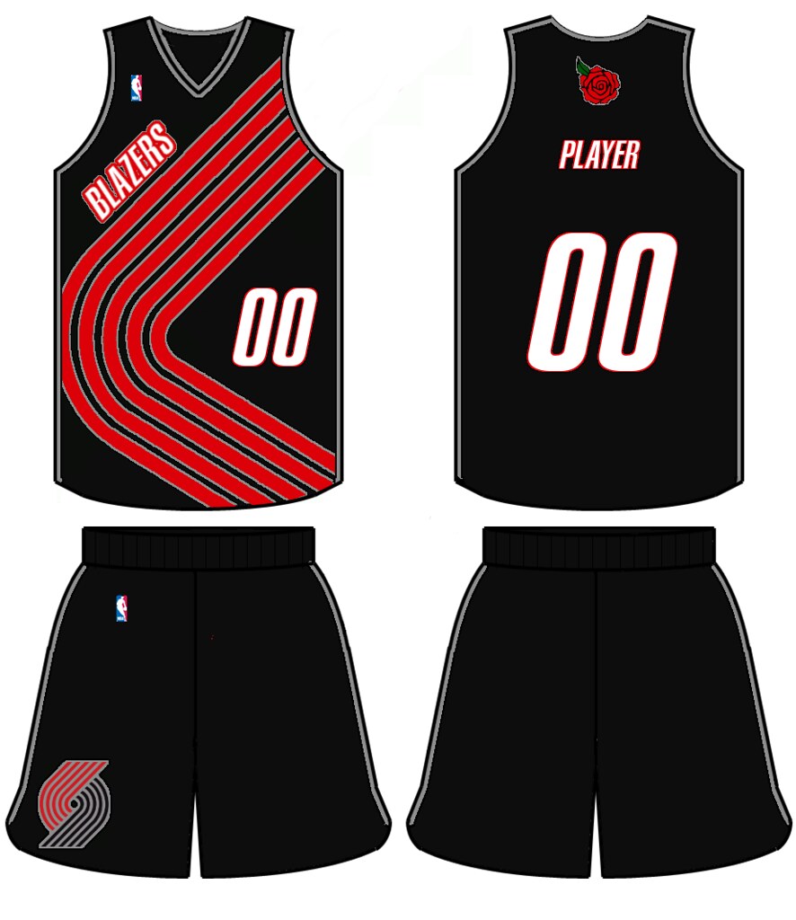
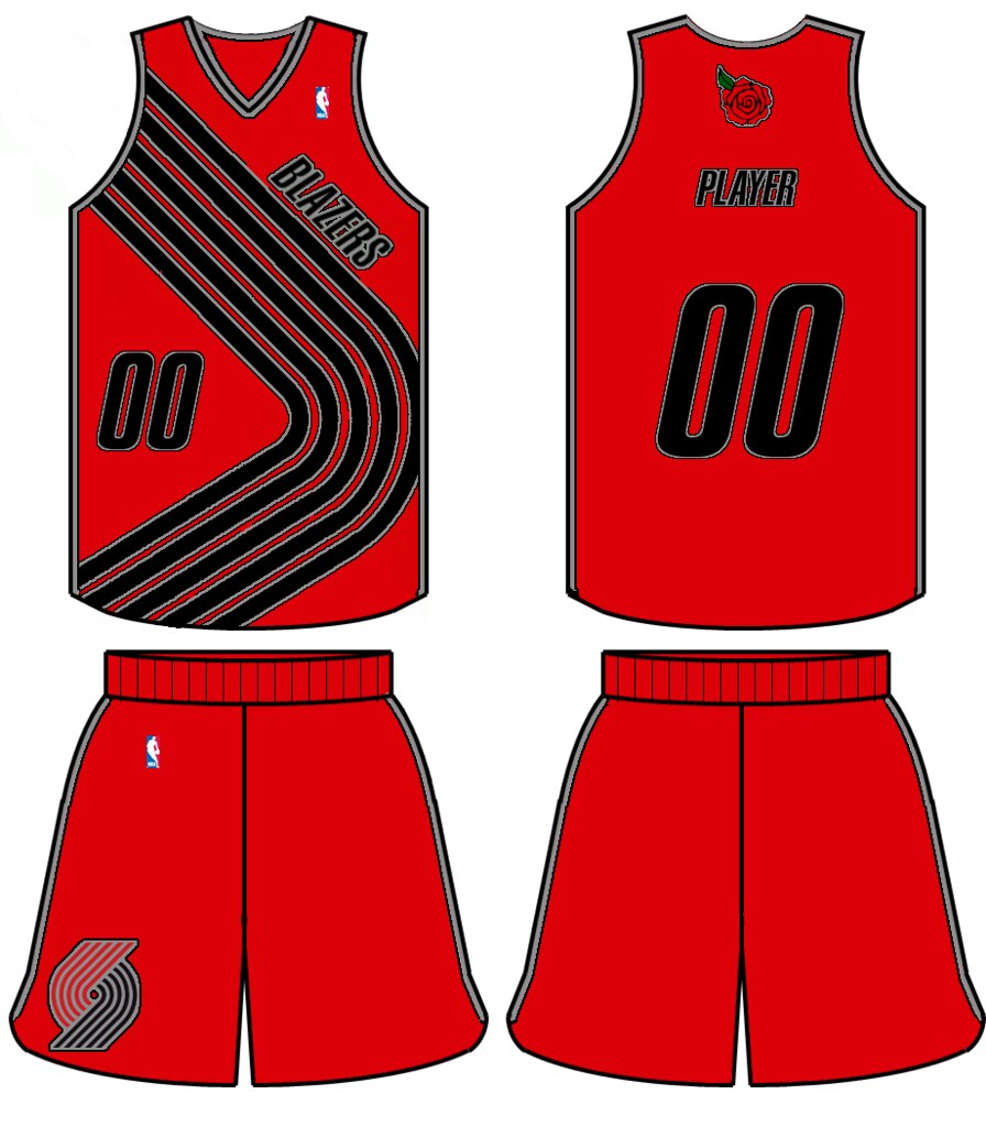
2. Best Diagonal-Based Design: Aaron Vaubel. One of the Blazers' visual signatures is the use of diagonal striping on the jersey. Lots of readers chose to maintain the diagonal motif, but Aaron Vaubel came up with the most interesting way of doing it, using a diagonal stroke as a dividing line for a two-tone concept:


Vaubel also submitted a variety of solid-colored alternates, but they're not as interesting as the two-tone treatments.
Diagonal-Striping Honorable Mentions: You have to look closely to see it, but Thomas Fiers incorporated a pinwheel into his diagonal striping. The best of both worlds! ... Andrew von Haslingen used diagonal striping as the basis for a Portland skyline treatment. ... Dan Kennedy used a diagonal motif for an interesting set of color-blocked uniforms. ... Duke Stebbins used the diagonal concept to come up with a set that looks more like a soccer uni or a track and field uni. Not bad, although not really suited for the basketball court. ... Subtle move by Chris Giorgio, who put his diagonal stripes on the shoulder straps. He also used Portland's "Rose City" nickname to create a rose-themed logo, a rose-patterned alternate, and -- get this -- a rose accented NBA logo.
3. Best Civics Lesson: Ben Humphrey. Quick, do you know what the Portland city flag looks like? Right, neither does anyone else. But it's actually a really bold design, and Ben Humphrey has used it as the starting point for a very nice uniform set:

It's nice, although it doesn't feel very Trail Blazers-ish. Oddly enough, it feels more like a design for another NBA franchise that used to play in the Pacific Northwest -- the SuperSonics. (And in case you're wondering, the Sonics' uniforms had nothing to do with the Seattle flag.)
4. Best Designs by the Guy Who Always Keeps Us Guessing: Every time we run one of these contests, reader Tom Bierbaum can be counted upon for two things: a groovy little mascot character and some awesome uniforms for teams that have nothing to do with the contest at hand. His Blazers designs are interesting, but check out the opposing players -- those are some killer jersey concepts for the Raptors, Suns and Wizards:


At this point I'm convinced that Bierbaum saves his best design ideas for theopposing players in his illustrations. Good work, Tom -- keep 'em coming!
5. Best Designs From the Other Side of the World: James MacNeil's Australian Students. "I am an art teacher at Broome Senior High School, which is in an isolated coastal town of 15,000 people on the edge of the desert in northwest Australia," says James MacNeil. "Basketball is absolutely number one with the kids in town, so my passion for the NBA fits in pretty well. One of my classes at school is with a group of young indigenous boys, and I figured we'd spend a couple of classes working with Photoshop to enter your contest." Here are some of the results:

"I gave them a homemade template of the current uniform," says MacNeil. "Interestingly, they all chose to keep the stripes. They also independently chose different names across the chest. And as you can see from the uniform numbers they chose, apparently Brandon Roy still resonates in our community."
How cool is that? Maybe the NBA should consider an expansion franchise Down Under.
Want to see more? You can see all of the reader-submitted designs here. Meanwhile, which team should we redesign next? Send your suggestions here.
http://espn.go.com/nba/story/_/id/10151914/uni-watch-portland-trail-blazers-redesign-ideas
Dozens of readers accepted this challenge. Here are the most successful and interesting ones, broken down by category:
1. Best Pinwheel-Based Designs: Dan Hallber and Tyson Staab. The Blazers' pinwheel logo, which is supposed to represent the five-on-five dynamics of a basketball game, is one of the most unique marks in the league, and many readers found ways to give it a prominent role in their jersey designs. The most interesting approaches were taken by Dan Hallberg and Tyson Staab, both of whom chose to make the pinwheel big -- like, really big. The first three designs shown below are Hallberg's, and the fourth image is Staab's (for all of the images in this column, you can click to see larger versions):
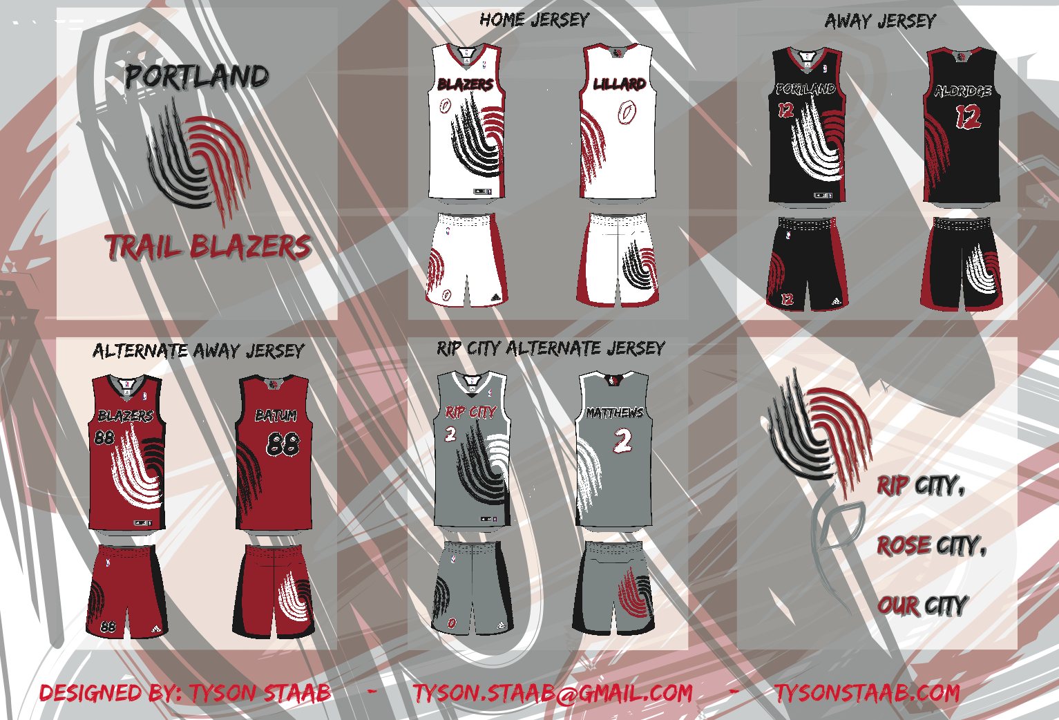
These designs are flawed but intriguing. Hallberg's concepts would be better if his oversized pinwheel graphics wrapped around to the back and/or onto the shorts, and Staab's uni set would benefit from better typography and a crisper presentation style. But both of them make good use of scale by blowing up the pinwheel to the point where it's almost an abstraction but still recognizable. These could definitely be revised into something very workable.
Pinwheel Honorable Mentions: In a clever move, Dennis Kuzman used the pinwheel design as the basis for a set of knee braces. ... Cole Hammers designed his own pinwheel-based type font. ... Kyle Emry made the pinwheel design look a little more modern by extending the lines and making them pointier. ... Tyler Smith suggests that the pinwheel be screened onto the back of the jersey, like Nike does with many of its college basketball designs. ... Bryan Spencer has changed the pinwheel from five-on-five to five-on-five-on-five. Maybe he knows something about upcoming NBA rule changes that the rest of us don't?
2. Best Diagonal-Based Design: Aaron Vaubel. One of the Blazers' visual signatures is the use of diagonal striping on the jersey. Lots of readers chose to maintain the diagonal motif, but Aaron Vaubel came up with the most interesting way of doing it, using a diagonal stroke as a dividing line for a two-tone concept:

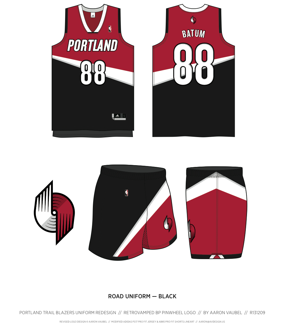
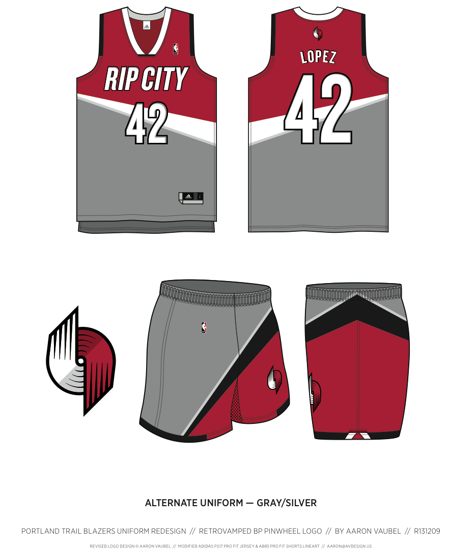
Vaubel also submitted a variety of solid-colored alternates, but they're not as interesting as the two-tone treatments.
Diagonal-Striping Honorable Mentions: You have to look closely to see it, but Thomas Fiers incorporated a pinwheel into his diagonal striping. The best of both worlds! ... Andrew von Haslingen used diagonal striping as the basis for a Portland skyline treatment. ... Dan Kennedy used a diagonal motif for an interesting set of color-blocked uniforms. ... Duke Stebbins used the diagonal concept to come up with a set that looks more like a soccer uni or a track and field uni. Not bad, although not really suited for the basketball court. ... Subtle move by Chris Giorgio, who put his diagonal stripes on the shoulder straps. He also used Portland's "Rose City" nickname to create a rose-themed logo, a rose-patterned alternate, and -- get this -- a rose accented NBA logo.
3. Best Civics Lesson: Ben Humphrey. Quick, do you know what the Portland city flag looks like? Right, neither does anyone else. But it's actually a really bold design, and Ben Humphrey has used it as the starting point for a very nice uniform set:
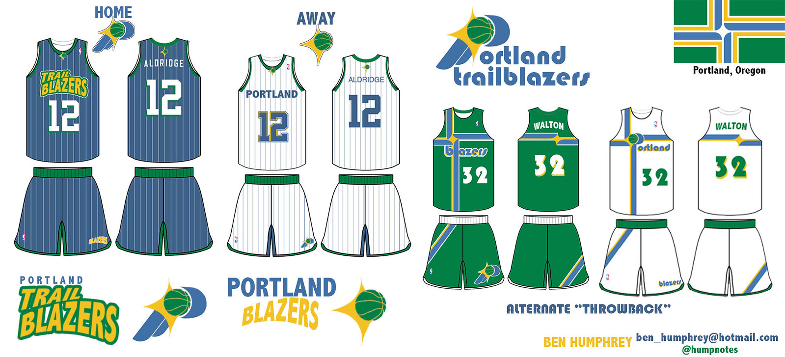
It's nice, although it doesn't feel very Trail Blazers-ish. Oddly enough, it feels more like a design for another NBA franchise that used to play in the Pacific Northwest -- the SuperSonics. (And in case you're wondering, the Sonics' uniforms had nothing to do with the Seattle flag.)
4. Best Designs by the Guy Who Always Keeps Us Guessing: Every time we run one of these contests, reader Tom Bierbaum can be counted upon for two things: a groovy little mascot character and some awesome uniforms for teams that have nothing to do with the contest at hand. His Blazers designs are interesting, but check out the opposing players -- those are some killer jersey concepts for the Raptors, Suns and Wizards:
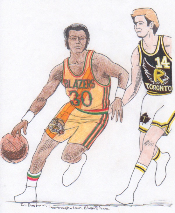
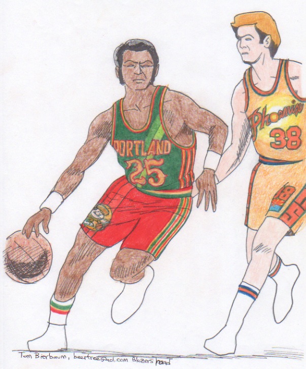

At this point I'm convinced that Bierbaum saves his best design ideas for theopposing players in his illustrations. Good work, Tom -- keep 'em coming!
5. Best Designs From the Other Side of the World: James MacNeil's Australian Students. "I am an art teacher at Broome Senior High School, which is in an isolated coastal town of 15,000 people on the edge of the desert in northwest Australia," says James MacNeil. "Basketball is absolutely number one with the kids in town, so my passion for the NBA fits in pretty well. One of my classes at school is with a group of young indigenous boys, and I figured we'd spend a couple of classes working with Photoshop to enter your contest." Here are some of the results:
"I gave them a homemade template of the current uniform," says MacNeil. "Interestingly, they all chose to keep the stripes. They also independently chose different names across the chest. And as you can see from the uniform numbers they chose, apparently Brandon Roy still resonates in our community."
How cool is that? Maybe the NBA should consider an expansion franchise Down Under.
Want to see more? You can see all of the reader-submitted designs here. Meanwhile, which team should we redesign next? Send your suggestions here.
http://espn.go.com/nba/story/_/id/10151914/uni-watch-portland-trail-blazers-redesign-ideas


