Navigation
Install the app
How to install the app on iOS
Follow along with the video below to see how to install our site as a web app on your home screen.
Note: This feature may not be available in some browsers.
More options
Style variation
You are using an out of date browser. It may not display this or other websites correctly.
You should upgrade or use an alternative browser.
You should upgrade or use an alternative browser.
Worst Logo in the NBA?
- Thread starter maybeso
- Start date
Hobbesarable
Cartoon Character
- Joined
- Aug 31, 2012
- Messages
- 6,773
- Likes
- 5,490
- Points
- 113
Yeah we need an upgrade for our logo. Been saying it for years now.
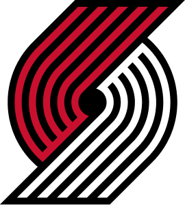
Take the pinwheel out of the parallelogram prison and tilt it back to its original position.
Mediocre Man
Mr. SportsTwo
- Joined
- Sep 23, 2008
- Messages
- 45,018
- Likes
- 27,996
- Points
- 113
It's iconic. It has a lot of sentimental value to people in Portland. Without the stupid ass silver or gray it's got great colors. I know it's a graphic design that depicts 5 on 5, but ask any kid across the country, or most any adult and they will have no idea what it means.
BlazerWookee
UNTILT THE DAMN PINWHEEL!
- Joined
- Sep 16, 2008
- Messages
- 13,258
- Likes
- 6,606
- Points
- 113
"FTW!," lol...
illmatic99
formerly yuyuza1
- Joined
- Sep 16, 2008
- Messages
- 57,819
- Likes
- 56,346
- Points
- 113
Damn everyone has usually liked our logo. That's surprising. Zach Lowe consistently ranks us near the top.
Didn't Casey or someone say they are actually updating our logo this year?
Didn't Casey or someone say they are actually updating our logo this year?
BBert
Weasels Ripped My Flesh
- Joined
- Sep 24, 2008
- Messages
- 27,062
- Likes
- 20,978
- Points
- 113
QFTTake the pinwheel out of the parallelogram prison and tilt it back to its original position.
This is the only 'upgrade' needed.
#Pinwheel4Life
BBert
Weasels Ripped My Flesh
- Joined
- Sep 24, 2008
- Messages
- 27,062
- Likes
- 20,978
- Points
- 113
I believe it's "pewter". Heavy on the "pew". I don't like it either.It's iconic. It has a lot of sentimental value to people in Portland. Without the stupid ass silver or gray it's got great colors. I know it's a graphic design that depicts 5 on 5, but ask any kid across the country, or most any adult and they will have no idea what it means.
illmatic99
formerly yuyuza1
- Joined
- Sep 16, 2008
- Messages
- 57,819
- Likes
- 56,346
- Points
- 113
This was in Sept 2015.
Casey responded.
"This should be higher than no. 7, but the current pinwheel is drowning in a black mass. Set that baby free, Portland. Let it fly and spin. Some folks prefer the old straight up-and-down version, but the slanted edition gets at the sport’s fast pace." - Zach Lowe
Casey responded.
blue9
Well-Known Member
- Joined
- Nov 25, 2012
- Messages
- 10,729
- Likes
- 7,169
- Points
- 113
What a fucking joke! LAC and OKC have the worst logos, and it's not even close. I mean, just look at the Clippers logo:

Ooops, I got confused, here it is:

And then ALL of the logos designed in the 90s are abhorrent. And BKN's doesn't even count as a logo.

Ooops, I got confused, here it is:
And then ALL of the logos designed in the 90s are abhorrent. And BKN's doesn't even count as a logo.
- Joined
- Oct 5, 2008
- Messages
- 129,747
- Likes
- 150,223
- Points
- 115
Does this mean the pinwheel gets the 1st pick in the logo draft?
Schilly
Well-Known Member
- Joined
- Oct 16, 2009
- Messages
- 3,161
- Likes
- 3,345
- Points
- 113
I do feel like they've been tanking for years.Does this mean the pinwheel gets the 1st pick in the logo draft?
Pinwheel1
Well-Known Member
- Joined
- Oct 13, 2008
- Messages
- 23,642
- Likes
- 16,294
- Points
- 113
Well I guess it is very subjective.........
Here is the author:
http://ftw.usatoday.com/author/charlotte-wilder
Here is the author:
http://ftw.usatoday.com/author/charlotte-wilder
blue9
Well-Known Member
- Joined
- Nov 25, 2012
- Messages
- 10,729
- Likes
- 7,169
- Points
- 113
It's true that design is largely subjective - but it's not entirely subjective. There is undeniably good and bad design. That's not to say that everyone will like something that it well designed - but someone's subjective dislike can't diminish what is objectively good.Well I guess it is very subjective.........
I'll be the first to admit that putting our logo inside a parallelogram is bad design. But that's NOT our logo. It has never been on our jersey, and as far as I can tell the only places it's ever been used is on website headers and TV splash graphics - and then only occasionally. Our logo is the pinwheel - period. However, we've taken what was once a great design and watered it down by tilting and tapering the pinwheel. Whoever is responsible for the parallelogram, tilting, and tapering should not have a job in graphic design.
Once the doldrums of summer really take hold I'm going to start a thread about how design affects how much I like or hate a team. There are many teams that I'll never like, and it's based entirely on their visual aesthetics.
BBert
Weasels Ripped My Flesh
- Joined
- Sep 24, 2008
- Messages
- 27,062
- Likes
- 20,978
- Points
- 113
Well I guess it is very subjective.........
Here is the author:
http://ftw.usatoday.com/author/charlotte-wilder
So...she's a flake. Got it.Charlotte Wilder is a writer and editor at For The Win. She's also New England's prodigal daughter, and David Ortiz once signed her flip-flop before the Sox won the Series in '04 (she has since lost it).
And one of her parents is named "New England". That's unique.
As Blue said, the pinwheel in the box is not our logo. I've never bought any item with the pinwheel in the box, and I never will. It's terrible. I agree with her on that.
Natebishop3
Don't tread on me!
- Joined
- Sep 17, 2008
- Messages
- 94,335
- Likes
- 57,656
- Points
- 113
The Warriors logo is the best in all of sports?
Yeah.... no.
Yeah.... no.
HolyBackboard
2 Hot 2 Stop It
- Joined
- Nov 7, 2015
- Messages
- 719
- Likes
- 1,593
- Points
- 93
The pinwheel? Yes. By itself, it's one of the greatest logos in all of sports. Although, I do wish we would drop the silver, soften the edges, and return it to its upright form (1970-1991).Damn everyone has usually liked our logo. That's surprising. Zach Lowe consistently ranks us near the top.
Didn't Casey or someone say they are actually updating our logo this year?
That monstrosity of a parallelogram? I can see why it ranked last. There's a reason you see hardly any merch with that logo on it or used by the Blazers on the broadcast, in-arena, or online. I believe the NBA mandates that teams must have a logo that shows off not only the main design (pinwheel in our case) but the city name and team name all wrapped into one logo, which is where the parallelogram came from.
Not a huge fan of this list. Denver is up way too high. Utah has one of the best logos in the league and it's 29? Not buying it.
HolyBackboard
2 Hot 2 Stop It
- Joined
- Nov 7, 2015
- Messages
- 719
- Likes
- 1,593
- Points
- 93
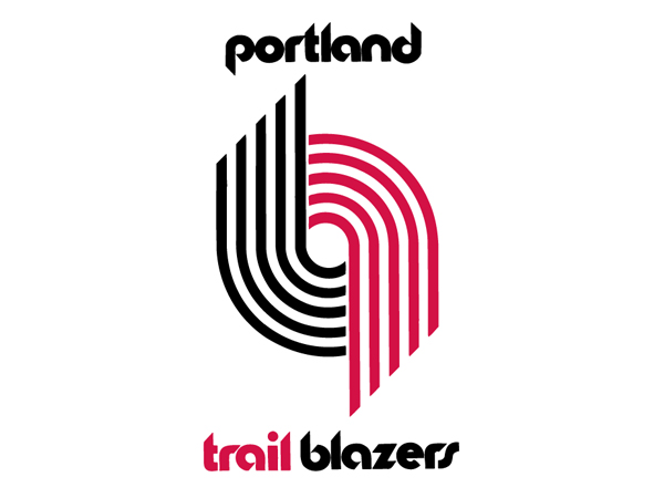
If you're reading this Blazers brass, just go back to this logo and this font and call it a day!!!This one works so much better than the current one:

The pinwheel is in its proper position and ties in brilliantly with the font. Sometimes you just shouldn't try to "fix" a classic that's not broken.
Orion Bailey
Forum Troll
- Joined
- Jan 27, 2015
- Messages
- 26,285
- Likes
- 21,510
- Points
- 113
Damn everyone has usually liked our logo. That's surprising. Zach Lowe consistently ranks us near the top.
Didn't Casey or someone say they are actually updating our logo this year?
IS this real? Ill wait on getting my tattoo then. (kinda laughing at Fonz now) haha
BlazerCaravan
Hug a Bigot... to Death
- Joined
- Sep 20, 2008
- Messages
- 28,071
- Likes
- 10,384
- Points
- 113
YES YES YES -- say it's for the 40th anniversary of our championship or something, just GO BACK PLEASE!If you're reading this Blazers brass, just go back to this logo and this font and call it a day!!!
blue9
Well-Known Member
- Joined
- Nov 25, 2012
- Messages
- 10,729
- Likes
- 7,169
- Points
- 113
Okay, I've gone back and read through her observations. A few things:
I don't think you knows what "ornate" means. Also, everything about the Pels aesthetics sucks - awful logo, awful colors.[PELICANS] ... and the ornate detail on the wings of the bird.
Thanks captain obvious! Who woulda thought that colors on opposite sides of the color wheel would "pop"!?! And lines creating a sense of movement? Brilliant![LAKERS] The colors are what makes the Lakers’ logo so great. The purple pops against the yellow, and the lines streaking off of the words gives it a sense of movement.
Should have incorporated another splash of red? So that it'd be more busy, which was your complaint about the Wizards logo that you rank ahead of the 76ers? Also, the 76ers logo is FUCKING GREAT![76ers] The red seems a little out of place here — they should’ve incorporated another splash of it somewhere else. Similar to the Wizards’ logo above...
I don't think you know what "retro" or "cool" mean. Or perhaps you're 3 years old? Maybe then this might look "retro"...except for the fact that it looks exactly like the generic WCF/ECF logos being used right now by the NBA.[CLIPPERS]... there’s something kind of retro and cool about the Clippers’ logo anyway.
First off, it doesn't look anything like Pac-Man - it looks like a Pac-Man ghost. Also, Pac-Man and the ghosts are great, iconic designs/characters![KINGS] The Kings recently changed their logo, and some fans took the team up on offers to get free tattoos of the new insignia. Which seems like a bad idea, considering it’s looks like an upside-down Pac-Man.
Soooooo, ORL should change their team colors? I don't disagree, but that doesn't really have anything to do with their logo design (which I agree is boring).[MAGIC] ...the colors just don’t pop like they could, and it’s pretty boring.
Is that a BAD thing? I thought you liked retro? Oh, right, you don't know what retro means. As much as I hate the Suns, this is a pretty damned good looking logo.[SUNS] Is this the logo of a Nintendo game from twenty years ago? Because that’s sure what it looks like.
Zero colors!?! For a team whose colors are black & grey!?! You don't say![SPURS] There are too many harsh edges going on here and zero colors.
But antlers [BUCKS] or insect abdomen [HORNETS] forming a basketball is legit? How is one to determine what sorts of objects can and can't be used to describe a basketball?[JAZZ] A basketball as a musical note? C’mon, now.
Natebishop3
Don't tread on me!
- Joined
- Sep 17, 2008
- Messages
- 94,335
- Likes
- 57,656
- Points
- 113
This one works so much better than the current one:

The pinwheel is in its proper position and ties in brilliantly with the font. Sometimes you just shouldn't try to "fix" a classic that's not broken.
Yup. Put it back!
BBert
Weasels Ripped My Flesh
- Joined
- Sep 24, 2008
- Messages
- 27,062
- Likes
- 20,978
- Points
- 113
This, Sir, is a terrific post.Okay, I've gone back and read through her observations. A few things:
I don't think you knows what "ornate" means. Also, everything about the Pels aesthetics sucks - awful logo, awful colors.
Thanks captain obvious! Who woulda thought that colors on opposite sides of the color wheel would "pop"!?! And lines creating a sense of movement? Brilliant!
Should have incorporated another splash of red? So that it'd be more busy, which was your complaint about the Wizards logo that you rank ahead of the 76ers? Also, the 76ers logo is FUCKING GREAT!
I don't think you know what "retro" or "cool" mean. Or perhaps you're 3 years old? Maybe then this might look "retro"...except for the fact that it looks exactly like the generic WCF/ECF logos being used right now by the NBA.
First off, it doesn't look anything like Pac-Man - it looks like a Pac-Man ghost. Also, Pac-Man and the ghosts are great, iconic designs/characters!
Soooooo, ORL should change their team colors? I don't disagree, but that doesn't really have anything to do with their logo design (which I agree is boring).
Is that a BAD thing? I thought you liked retro? Oh, right, you don't know what retro means. As much as I hate the Suns, this is a pretty damned good looking logo.
Zero colors!?! For a team whose colors are black & grey!?! You don't say!
But antlers [BUCKS] or insect abdomen [HORNETS] forming a basketball is legit? How is one to determine what sorts of objects can and can't be used to describe a basketball?
You should send it to her.

EL PRESIDENTE
Username Retired in Honor of Lanny.
- Joined
- Feb 15, 2010
- Messages
- 50,346
- Likes
- 22,533
- Points
- 113
This bitch be on crack
riverman
Writing Team
- Joined
- Nov 15, 2013
- Messages
- 69,285
- Likes
- 69,031
- Points
- 113
Our logo was and still is the best logo in sports...I loved the upright one but I also really like the tilt and the silver added...it's a classy logo either way. I do like the ripcity or portland without caps though
Last edited:
Similar threads
- Replies
- 21
- Views
- 1K
- Replies
- 24
- Views
- 2K
- Replies
- 4
- Views
- 264
Users who are viewing this thread
Total: 1 (members: 0, guests: 1)

