EL PRESIDENTE
Username Retired in Honor of Lanny.
- Joined
- Feb 15, 2010
- Messages
- 50,346
- Likes
- 22,533
- Points
- 113
Maybe the new Blazers jerseys are just the current jerseys, covered in mud?
Follow along with the video below to see how to install our site as a web app on your home screen.
Note: This feature may not be available in some browsers.
You sure that was mud?Maybe the new Blazers jerseys are just the current jerseys, covered in mud?
You sure that was mud?
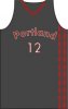
View attachment 14036
I messed around in Microsoft Paint. If you got something like this done professionally,, with the gray city skyline below the logo and mountain, and some gray clouds above the mountain and behind the pinwheel, and put "PORTLAND TRAIL BLAZERS" in the top red section of the circle, and "Rip City, Oregon" in the bottom part of the circle, it would look sick I think.
@Darkwebs I feel like you're talented enough to pull this idea off and make it look legit. I'd love to see you try!

I felt the same way about your sister before our first date! #BAMI don't think there's anyway these aren't going to absolutely suck.
I felt the same way about your sister before our first date! #BAM
Of course it does, it was done in 5 minutes with MS Paint. You can't make it not ugly lol.I don't want to hurt your feelings because I am sure you worked hard on that but that's ugly dude.
Sorry.
Wow those are ugly
I'd like something like this - simple while keeping the stripe.
There's WAY too much going on here. Maximalism doesn't belong in logo design.View attachment 14036
I messed around in Microsoft Paint. If you got something like this done professionally,, with the gray city skyline below the logo and mountain, and some gray clouds above the mountain and behind the pinwheel, and put "PORTLAND TRAIL BLAZERS" in the top red section of the circle, and "Rip City, Oregon" in the bottom part of the circle, it would look sick I think.
@Darkwebs I feel like you're talented enough to pull this idea off and make it look legit. I'd love to see you try!
I actually think it's really close to being good. It's very 70s. Pink/orange is an awesome color combo.Wow those are ugly

That tilted box rectangle logo SUUUUUCKS!!!! It looks so bad on any clothing item.I thought one of the biggest issues that I had heard about NBA logos is that they require the name of the team and city in the logo, which is why we have that hideous box looking thing.


I actually think it's really close to being good. It's very 70s. Pink/orange is an awesome color combo.
Reminds me of the Shadow/Chemist Product Placement album art:
You sure that was mud?
Imagine them with a red and white stripe, they would be so dope! Old SchoolWow those are ugly
"Dope," lol...Imagine them with a red and white stripe, they would be so dope! Old School
I hear that's what the kids are smokin these days."Dope," lol...

You mock me and my streetness? I still listen to hip hop loud in my car as well. It's in my blood FAMS. It's who I am. Take it or leave it."Dope," lol...
A guy your age saying "dope" is like a guy my age NOT saying "YOU KIDS GET OFF MY LAWN!"You mock me and my streetness? I still listen to hip hop loud in my car as well. It's in my blood FAMS. It's who I am. Take it or leave it.
Streetness? Have you even been to jail FAMS?You mock me and my streetness? I still listen to hip hop loud in my car as well. It's in my blood FAMS. It's who I am. Take it or leave it.
We could have a Jamaican guy do our ads. "Blazers, only team with the red stripe man".Imagine them with a red and white stripe, they would be so dope! Old School
OH SHIT! Here we go AGAIN!!!??Streetness? Have you even been to jail FAMS?
I can see great grandpa causing panic leaving Poland. 'We must find a new home. Where our children can practice their hop hip without being persecuted for their love, famskiy.'You mock me and my streetness? I still listen to hip hop loud in my car as well. It's in my blood FAMS. It's who I am. Take it or leave it.