BigGameDamian
Well-Known Member
- Joined
- Oct 19, 2012
- Messages
- 35,160
- Likes
- 14,391
- Points
- 113
Follow along with the video below to see how to install our site as a web app on your home screen.
Note: This feature may not be available in some browsers.
I don’t even know how that got posted. I typed,”touch me FAMS, touch me!”Ok, which one of you bastards taught him that word?
Although, impressive that you used it correctly.


The Cavs center-court logo looks like the ball is shattering a glass net.Here are other 50th anniversary designs around the league this year.

I kinda like that color scheme tho.The Cavs center-court logo looks like the ball is shattering a glass net.


I dont like:
- The shade of red
- The two-tone key and semi-circle (especially a white key)
- Brightly colored perimeter
- Minimilastic center court logo
- All lower-case lettering
- The Moda Center seats and the court will have an awkward two-tone red color contrast.
I know some of these things are "classic" but I also think its tacky and that the organization was right to move away from these types of stylings. I dont have any nostalgic feelings so this is simply based off aesthetic and my taste.
The Cavs have the biggest identity crisis in the League ... even when they had LeBron, they continued to alter their team colors and uniforms. Looking over their team history it looks like they jump from design to design every 4-5 years. They really need to pick an identity and stick with it.
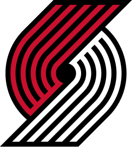
UNTILT THE PINWHEEL!
Need this somewhere on our jerseys. In the right orientation.
No thanksUNTILT THE PINWHEEL!
you call your own fingers FAMS?I typed,”touch me FAMS, touch me!”
Thats for my people FAMS....
View attachment 27388
I can’t believe they won’t just put the pinwheel back how it is supposed to be. The OG way. It’s iconic. Best logo in sports FAMS.
Hell to the fuck yeah!Thats awesome.
You ask FAMS......and you shall receive.I can’t believe they won’t just put the pinwheel back how it is supposed to be. The OG way. It’s iconic. Best logo in sports FAMS.

