EL PRESIDENTE
Username Retired in Honor of Lanny.
- Joined
- Feb 15, 2010
- Messages
- 50,346
- Likes
- 22,533
- Points
- 113
discuss.
Follow along with the video below to see how to install our site as a web app on your home screen.
Note: This feature may not be available in some browsers.
It will take some time to get used to it. It's much harder to edit a long post, for example. We'll see how it goes. You can't navigate easily from the bottom of the page, but rather have to hit "top" and then click on "Blazer OT Forum".
See attachment.
The editor has a resize box in the lower right corner (at least for me in Google Chrome), and buttons to change the height (bigger/smaller).
Note a new feature - when you click "reply" or "reply with quote" under a post, it opens the quick reply editor right there, instead of jumping you to the bottom of the page.
You can navigate from bottom of the page to any forum - see "quick navigation"
I also added a "TOP" link on every post that jumps you to the top of the page. I don't know many other vb sites doe this...
If I click the button that says "Blazers OT Forum", it opens a menu that allows me to go to all the forums. There are scores of forums on S2; if I simply want to return to the Blazers OT Forum, I have to go down the list and find it. It's easier to click "Top" and then click on "Blazers OT Forum". The old forum would take you directly back to the menu in whichever forum you were in when you clicked on the forum box on the bottom.
There seems to be no separation from a person's post to the signature. I think the old version had a line or something.
Also, just an idea, but maybe you can try an alternate color scheme, with the white background as primary, and this gray one as secondary??
If I click the button that says "Blazers OT Forum", it opens a menu that allows me to go to all the forums. There are scores of forums on S2; if I simply want to return to the Blazers OT Forum, I have to go down the list and find it. It's easier to click "Top" and then click on "Blazers OT Forum". The old forum would take you directly back to the menu in whichever forum you were in when you clicked on the forum box on the bottom.
Quick Navigation defaults to Blazers OT Forum for me in this thread. Is it not like that for you?
You can see that the white background surrounding the actual post area, which is gray. Can that one be the primary background color for the text?
We can increase the font size
Which fonts/text is too small?
Hold control and press "+" ?just overall the fonts seem smallish. especially when you're viewing the threads at once...on previous they were a bit larger.
I think it will take a tiny bit getting used to, and then will seem perfectly fine.
A few things, I agree with maxie, I want it to default to the page you are on in the quick navagation, instead of having to scroll through all of them.
Also, why is it when a post is quited by someone, there seems to be a very large gap between the top of the post, and where text actually shows up?
So I can do more with the skin, if you guys have suggestions. Colors too dark? Not red enough? Whatever you want done, let me know ;-)

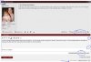
Like this. Big gap from the top to all the way down here.
My first thought was that the primary colour tone is not red enough...it's too burgundy. I feel like I'm on a Washington Redskins site...which may be fine for maxiep, but...
My first thought was that the primary colour tone is not red enough...it's too burgundy. I feel like I'm on a Washington Redskins site...which may be fine for maxiep, but...
See attachment, this is what I see: