- Joined
- Mar 14, 2006
- Messages
- 606
- Likes
- 359
- Points
- 63
Follow along with the video below to see how to install our site as a web app on your home screen.
Note: This feature may not be available in some browsers.
They will by having the Blazers get stomped on every time they play in them.I don’t think they are terrible... but I’m pretty disappointed they didn’t incorporate pdx carpet

You're not old know that 50s lingo! would make a great band name eh?Y'all fuddy duddys
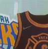
Our Red jerseys and these are both nice.
Y'all fuddy duddys need to quit.